This is a quick WordPress guide that shows you how to create a feedback popup on your website using Gravity forms or any other form builder. This guide is meant for users that have basic experience with PHP, CSS and HTML. We will use a basic Gravity form and a minimal basic modal popup, no additional plugins are needed, this is a very lightweight but effective popup.
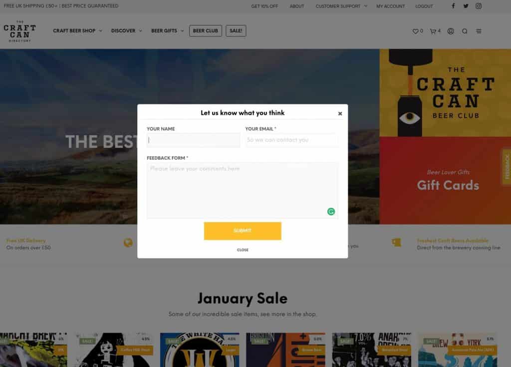
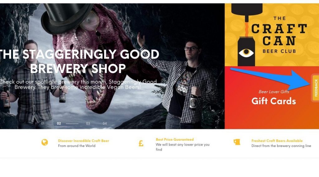
We will essentially create a simple feedback popup that you may see on many sites such as the Craft Can Directory, this method is very similar to how we built the Craft Can Directory feedback popup. You will need to access your theme functions.php and create a short feedback or contact form in Gravity forms or even Contact form 7.
The Basic HTML
You can use the HTML below and modify to your exact needs, this is very basic and includes a title, close icon (dependant on FontAwesome, you can replace with a pure CSS close icon). You can change the title and any other text from our default and the shortcode for your Gravity form or for another form if you aren’t using Gravity Forms.
	<a id="popup" class="feedback-toggle feedback-button">Feedback</a>


	<div class="modal">
		<div class="modal-overlay feedback-toggle"></div>
		<div class="modal-wrapper modal-transition">
		  <div class="modal-header">
		    <span class="modal-close feedback-toggle"><i class="fa fa-times" aria-hidden="true"></i></span>
		    <h6 class="modal-heading">Let us know what you think</h6>
		  </div>

		  <div class="modal-body">
		    <div class="modal-content">
				<?php echo do_shortcode( 'PUT FORM SHORTCODE HERE' ); ?>
		      <span class="feedback-toggle modal-text-close">Close</span>
		    </div>
		  </div>
		</div>
	</div>
The Javascript
Keeping things very lightweight we need just this simple javascript function to make the popup show when we click the feedback button. This is dependant on the jQuery library, so ensure that you have enqueued a jQuery library first.
	<script>
	jQuery(document).ready(function() {
		jQuery('.feedback-toggle').on('click', function(e) {
			e.preventDefault();
			jQuery('.modal').toggleClass('is-visible');
		});
	});
	</script>
The CSS
This CSS is created to enable a basic popup and also style the feedback button to remain fixed to the righthand side of the viewport. Please adjust this as needed.
<style>
		li#field_4_3, li#field_4_1 {
		    width: 50%;
		    display: inline-block;
		    vertical-align: top;
		    margin: 10px 0 0;
		}

		.modal .gform_wrapper label.gfield_label {
			font-size: 12.5px;
		}

		.modal .gform_wrapper .gform_footer {
			text-align: center;
			padding: 0;
			margin: 10px auto;
		}

		body .modal .gform_wrapper .top_label div.ginput_container {
			margin-top: 0;
		}

		@media screen and (min-width:980px) {
			.modal .gform_wrapper form {
				padding-left: 15px;
			}
		}

		.modal {
			position: fixed;
			z-index: 10000;
			top: 0;
			left: 0;
			visibility: hidden;
			width: 100%;
			width: 100vw;
			height: 100%;
			height: 100vh;
		}

		.modal.is-visible {
		    visibility: visible;
		}

		.modal-overlay {
		  position: fixed;
		  z-index: 10;
		  top: 0;
		  left: 0;
		  width: 100%;
		  height: 100%;
		  background: hsla(0, 0%, 0%, 0.5);
		  visibility: hidden;
		  opacity: 0;
		  transition: visibility 0s linear 0.3s, opacity 0.3s;
		}

		.modal.is-visible .modal-overlay {
		  opacity: 1;
		  visibility: visible;
		  transition-delay: 0s;
		}

		.modal-wrapper {
			position: absolute;
			width: 92%;
			max-width: 600px;
			padding: 10px;
			text-align: center;
			background: #fff;
			border-radius: 5px;
			z-index: 9999;
			top: 50%;
			left: 50%;
			-moz-transform: translate(-50%, -50%);
			-o-transform: translate(-50%, -50%);
			-ms-transform: translate(-50%, -50%);
			-webkit-transform: translate(-50%, -50%);
			transform: translate(-50%, -50%);
		}

		.modal-transition {
		  transition: all 0.3s 0.12s;
		  opacity: 0;
		}

		.modal.is-visible .modal-transition {
		  opacity: 1;
		}

		.modal-header, .modal-content {
		    padding: 2px;
		}

		.modal-header {
		  position: relative;
		  border-bottom: 1px solid #e8e8e8;
		}

		.modal-close {
		    position: absolute;
		    top: 0;
		    right: 0;
		    padding: 6px;
		    cursor: pointer;
		}

		.modal-close:hover {
		  color: #edb127;
		}

		.modal-heading {
		  font-size: 1.125em;
		  margin: 0;
		  -webkit-font-smoothing: antialiased;
		  -moz-osx-font-smoothing: grayscale;
		}

		.modal-content > *:first-child {
		  margin-top: 0;
		}

		.modal-content > *:last-child {
		  margin-bottom: 0;
		}

		.modal-text-close {
		    text-transform: uppercase;
		    font-size: 10px;
		    font-weight: 900;
		    text-align: center;
		    cursor: pointer;
		}

		.modal-text-close:hover {
			color: #edb127;
		}

		.feedback-button {
		    height: 30px;
		    background: #edb127;
		    width: 100px;
			padding: 6px 0 5px 0;
		    -webkit-transform: rotate(-90deg);
		    color: white;
		    transform: rotate(-90deg);
		    -ms-transform: rotate(-90deg);
		    -moz-transform: rotate(-90deg);
		    text-align: center;
		    font-size: 13px;
		    font-weight: 900;
		    position: fixed;
		    right: -40px;
		    top: 45%;
		    z-index: 999;
		    text-transform: uppercase;
		    border-radius: 5px 5px 0 0;
		    box-shadow: 0 0 0 7px rgba(238, 238, 238, 0.17);
		    transition: all .3s;
		}

		.feedback-button:hover {
		    box-shadow: 0 0 0 14px rgba(255, 255, 255, 0.2);
		}

		@media screen and (max-width: 980px) {
			.feedback-button {
			    font-size: 9px;
			    width: 65px;
			    right: -24px;
			}
		}
	</style>
The function to create a Gravity form popup
Let’s put all the above together in a function and load in the footer of your website. This will display on all pages and posts of your site, if you want to load it conditionally you can create a simple function to load on certain pages, posts, etc.
/**
 * Popup Function
 * https://lakewood.media/create-simple-gravity-form-feedback-popup/
 */
function lakewood_popup() { ?>
	<style>
		li#field_4_3, li#field_4_1 {
		    width: 50%;
		    display: inline-block;
		    vertical-align: top;
		    margin: 10px 0 0;
		}

		.modal .gform_wrapper label.gfield_label {
			font-size: 12.5px;
		}

		.modal .gform_wrapper .gform_footer {
			text-align: center;
			padding: 0;
			margin: 10px auto;
		}

		body .modal .gform_wrapper .top_label div.ginput_container {
			margin-top: 0;
		}

		@media screen and (min-width:980px) {
			.modal .gform_wrapper form {
				padding-left: 15px;
			}
		}

		.modal {
			position: fixed;
			z-index: 10000;
			top: 0;
			left: 0;
			visibility: hidden;
			width: 100%;
			width: 100vw;
			height: 100%;
			height: 100vh;
		}

		.modal.is-visible {
		    visibility: visible;
		}

		.modal-overlay {
		  position: fixed;
		  z-index: 10;
		  top: 0;
		  left: 0;
		  width: 100%;
		  height: 100%;
		  background: hsla(0, 0%, 0%, 0.5);
		  visibility: hidden;
		  opacity: 0;
		  transition: visibility 0s linear 0.3s, opacity 0.3s;
		}

		.modal.is-visible .modal-overlay {
		  opacity: 1;
		  visibility: visible;
		  transition-delay: 0s;
		}

		.modal-wrapper {
			position: absolute;
			width: 92%;
			max-width: 600px;
			padding: 10px;
			text-align: center;
			background: #fff;
			border-radius: 5px;
			z-index: 9999;
			top: 50%;
			left: 50%;
			-moz-transform: translate(-50%, -50%);
			-o-transform: translate(-50%, -50%);
			-ms-transform: translate(-50%, -50%);
			-webkit-transform: translate(-50%, -50%);
			transform: translate(-50%, -50%);
		}

		.modal-transition {
		  transition: all 0.3s 0.12s;
		  opacity: 0;
		}

		.modal.is-visible .modal-transition {
		  opacity: 1;
		}

		.modal-header, .modal-content {
		    padding: 2px;
		}

		.modal-header {
		  position: relative;
		  border-bottom: 1px solid #e8e8e8;
		}

		.modal-close {
		    position: absolute;
		    top: 0;
		    right: 0;
		    padding: 6px;
		    cursor: pointer;
		}

		.modal-close:hover {
		  color: #edb127;
		}

		.modal-heading {
		  font-size: 1.125em;
		  margin: 0;
		  -webkit-font-smoothing: antialiased;
		  -moz-osx-font-smoothing: grayscale;
		}

		.modal-content > *:first-child {
		  margin-top: 0;
		}

		.modal-content > *:last-child {
		  margin-bottom: 0;
		}

		.modal-text-close {
		    text-transform: uppercase;
		    font-size: 10px;
		    font-weight: 900;
		    text-align: center;
		    cursor: pointer;
		}

		.modal-text-close:hover {
			color: #edb127;
		}

		.feedback-button {
		    height: 30px;
		    background: #edb127;
		    width: 100px;
			padding: 6px 0 5px 0;
		    -webkit-transform: rotate(-90deg);
		    color: white;
		    transform: rotate(-90deg);
		    -ms-transform: rotate(-90deg);
		    -moz-transform: rotate(-90deg);
		    text-align: center;
		    font-size: 13px;
		    font-weight: 900;
		    position: fixed;
		    right: -40px;
		    top: 45%;
		    z-index: 999;
		    text-transform: uppercase;
		    border-radius: 5px 5px 0 0;
		    box-shadow: 0 0 0 7px rgba(238, 238, 238, 0.17);
		    transition: all .3s;
		}

		.feedback-button:hover {
		    box-shadow: 0 0 0 14px rgba(255, 255, 255, 0.2);
		}

		@media screen and (max-width: 980px) {
			.feedback-button {
			    font-size: 9px;
			    width: 65px;
			    right: -24px;
			}
		}
	</style>
	<script>
	jQuery(document).ready(function() {
		jQuery('.feedback-toggle').on('click', function(e) {
			e.preventDefault();
			jQuery('.modal').toggleClass('is-visible');
		});
	});
	</script>
	<a id="popup" class="feedback-toggle feedback-button">Feedback</a>


	<div class="modal">
		<div class="modal-overlay feedback-toggle"></div>
		<div class="modal-wrapper modal-transition">
		  <div class="modal-header">
		    <span class="modal-close feedback-toggle"><i class="fa fa-times" aria-hidden="true"></i></span>
		    <h6 class="modal-heading">Let us know what you think</h6>
		  </div>

		  <div class="modal-body">
		    <div class="modal-content">
				<?php echo do_shortcode( '[gravityform id="CHANGE FOR FORM ID" title="false" description="false" ajax="true"]' ); ?>
		      <span class="feedback-toggle modal-text-close">Close</span>
		    </div>
		  </div>
		</div>
	</div>
	<?php
}
add_action( 'wp_footer', 'lakewood_popup' );