We have been busy since new year working on something special. You may have noticed our logo has changed slightly over the past few weeks, well its all been part of a restructuring at Lakewood. Since 2013 our website and branding has remained the same. We wanted to give the brand a complete overhaul but still keep the original elements.
Updating the branding
The first thing that we addressed was the Lakewood media branding, it has remained relatively the same since 2013, only seeing a few adjustments to the text. The idea of the branding that was designed in 2013 was to add emphasis to the role we have played in various outdoor and sports companies. That along with our passion for the outdoors the branding always had to have an element of nature to it.
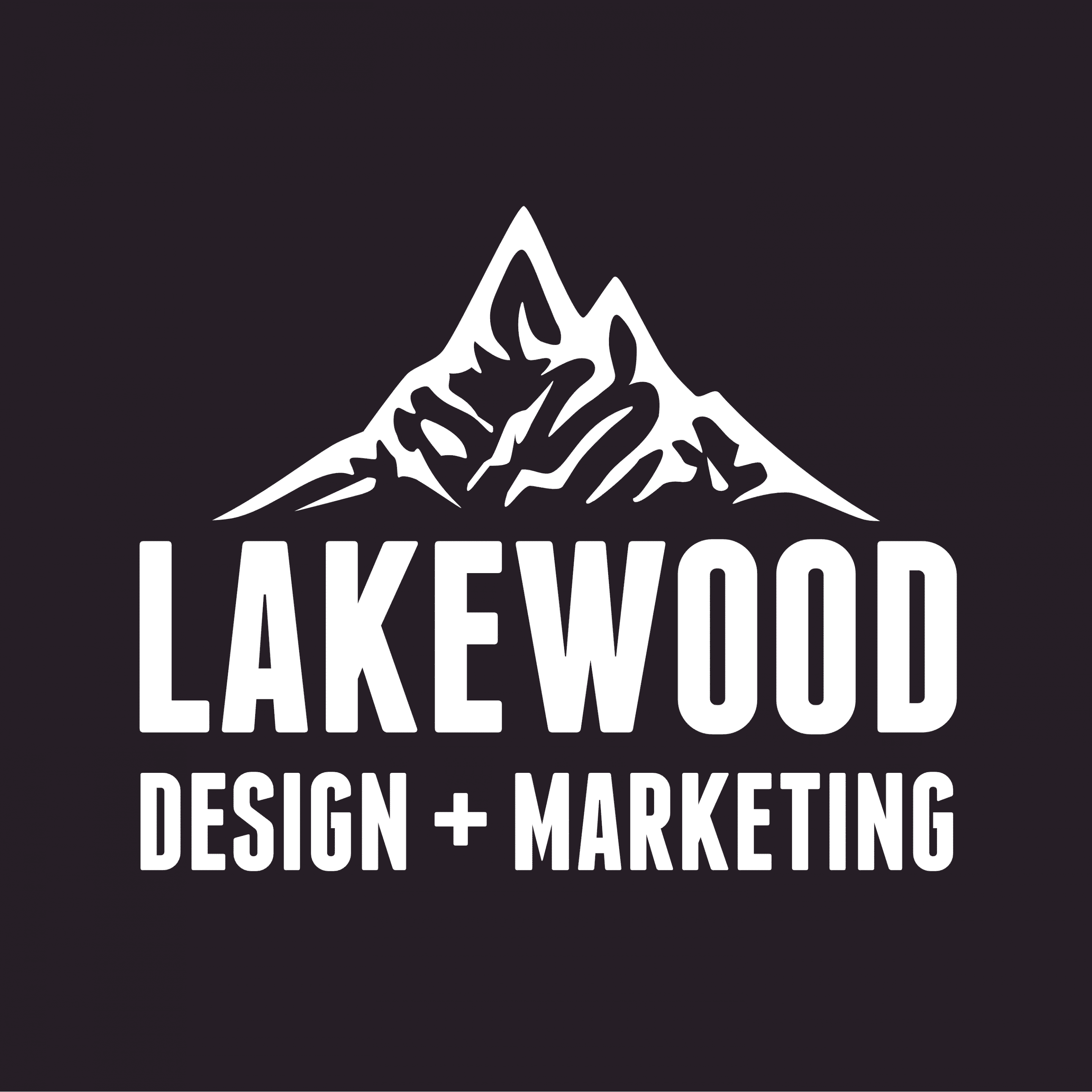
The problem we found with the old branding was the lack of identity, at a glance, there wasn’t many recognisable features or clear company name. We wanted the new brand to still feature the mountain brand mark but display the name of the company prominently.
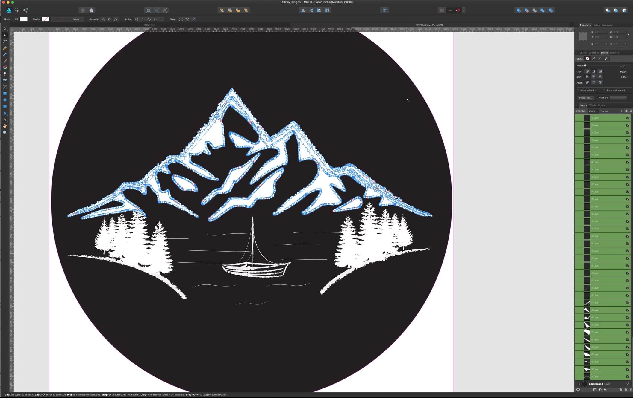
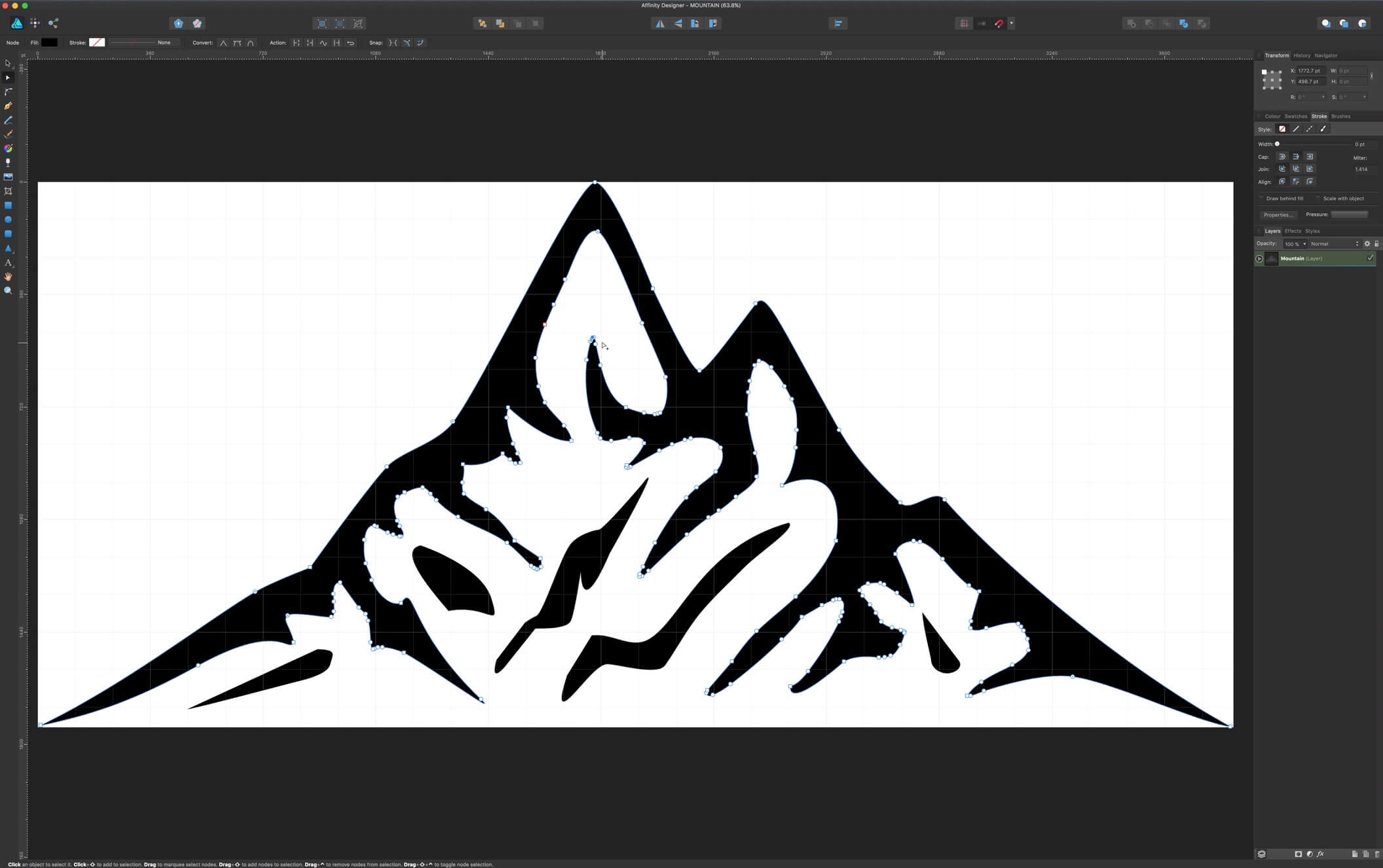
How it evolved

A super new website
The outline for the new website was simple. It had to be clear, simple to navigate and straight to the point. We planned to launch new services and wanted to showcase them on the site along with work we had already done. Other sections of the old site were given some new life, such as the journal which lived on a subdomain, now has a home on the core Lakewood site.
Using a WordPress CMS to easily keep things up to date we developed the site to meet our exact needs and even added a few additional sections to help our clients out. We added a client area to address the problem clients have sending us large files. We often get sent dropbox links and have to download a zip file and then we have to then upload it again to our Google Drive based system, the whole process was tedious, to say the least. We wanted clients to be able to log into the Lakewood site and see all their project files that we stored have on our system and also be able to upload more files using a simple drag and drop interface.
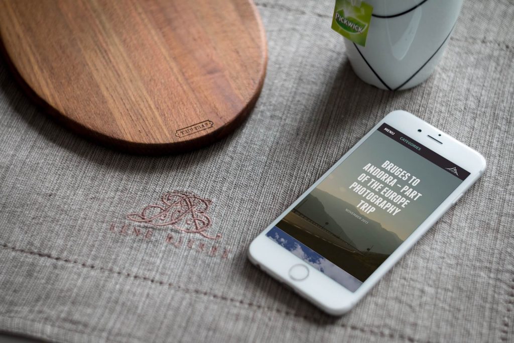
Made for all devices
As a standard practice we designed the new Lakewood website to work on all devices. When designing we started with the interfaces for mobile screens and worked up, this way the site is native to all screen sizes and keeps a uniform style and layout on all devices.
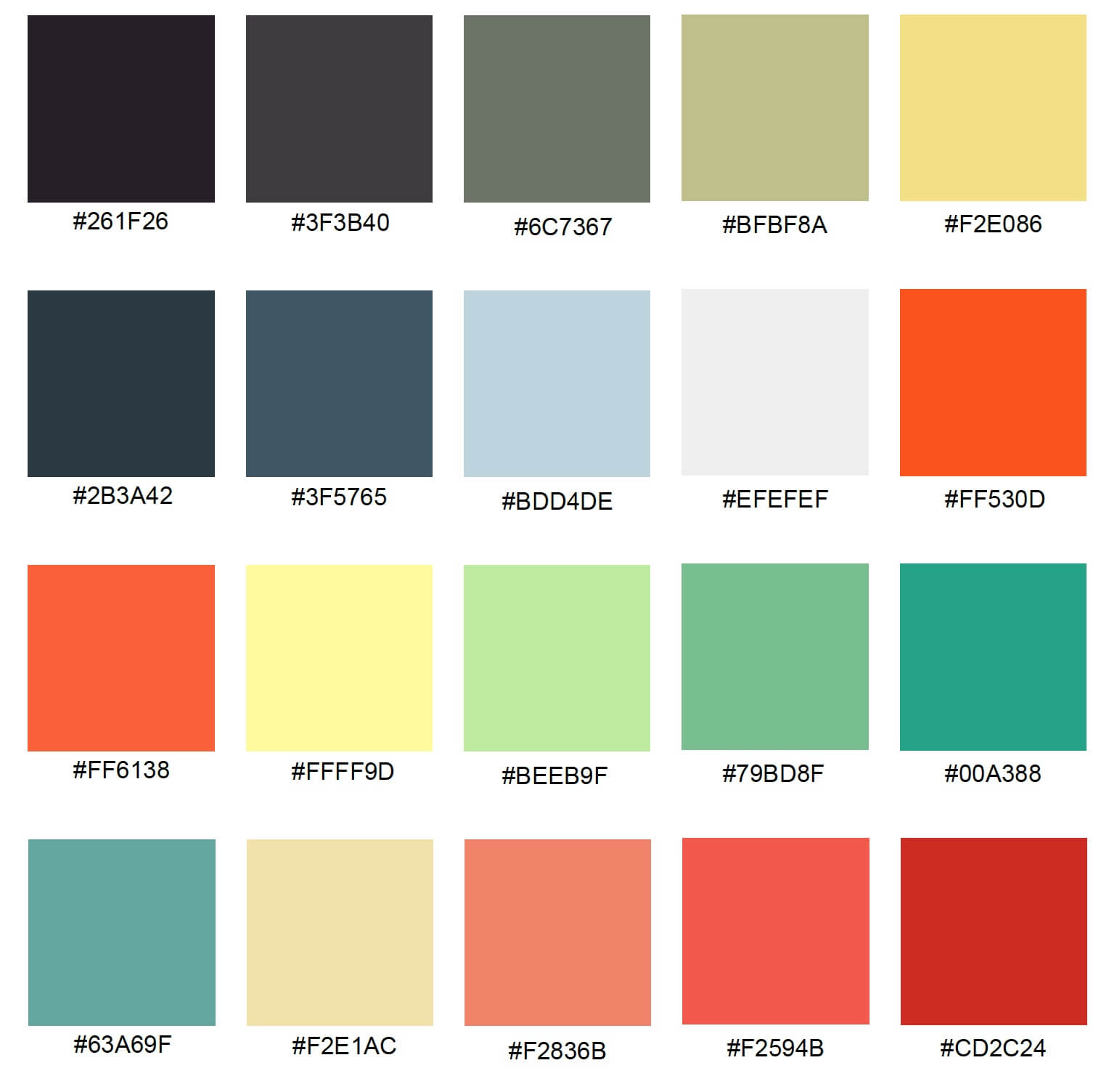
The Brand Colours
One of the factors we wanted to improve the most from the previous branding was the colour scheme, we wanted to bring more colour to the brand and improve the way colours enhance the functions of the website.
Below is the extended colour scheme for the Lakewood brand.
Please take a look around the site and please let us know your thoughts on Twitter via @lakewoodmedia or our Facebook page.